


Doctor Website Templates Using HTML and CSS
₹49.00
Responsive website design refers to the practice of creating websites that can adapt to different screen sizes and devices, such as desktops, laptops, tablets, and smartphones. This is achieved by using HTML and CSS to create flexible layouts that can adjust and reorganize content depending on the size of the screen.
Description
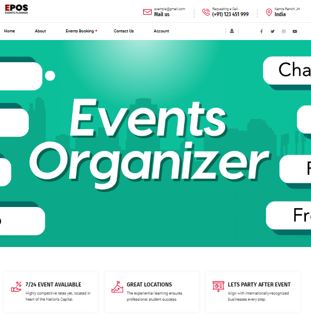
Responsive Website Templates using HTML and CSS
Languages :-
HTML, CSS, Javascript, Bootstrap Ajax
Description :
Responsive website design refers to the practice of creating websites that can adapt to different screen sizes and devices, such as desktops, laptops, tablets, and smartphones. This is achieved by using HTML and CSS to create flexible layouts that can adjust and reorganize content depending on the size of the screen.
A responsive website design is crucial for a blogging website as it ensures that the content is easily accessible and readable on any device. This can improve user experience and increase engagement, as visitors are more likely to stay on the website if they can easily navigate and consume the content.
Some key elements of responsive website design include using flexible grids and media queries to adjust the layout and font sizes, optimizing images and videos for different devices, and prioritizing content based on its importance and relevance.
By implementing responsive website design principles, bloggers can create a seamless and consistent experience for their readers, regardless of the device they are using to access the website.
Related products
-
- Sale!
Events Management System Using PHP Mysql
- ₹2,500.00
-
- Sale!
Complete NGO Website using HTML and CSS
- ₹199.00
-
- Sale!
Personal Portfolio and Resume HTML Template
- ₹149.00


Reviews
There are no reviews yet.